Pop-ups on websites: Contemporary or annoying?
In today’s world of online marketing, pop-ups and inline CTAs (call-to-actions) are ubiquitous. But which method is really more successful in increasing conversion rates? In this article, I present an analysis comparing the success of pop-ups and inline CTAs.
Motivation for comparing inline CTAs and pop-ups
Pop-ups are ubiquitous on websites and are among the most annoying elements on websites. I myself have noticed in my surfing behavior that I have already developed an automatism to click away pop-ups as quickly as possible — even without accidentally subscribing to a newsletter or accepting cookies. At the same time, pop-ups are known to catch the user’s attention and often lead to more interactions.
As the operator of the blog “der-braukurs.de”, I know the challenge of attracting new newsletter subscribers. So far, I have always relied on the combination of freebie and pop-up, which has worked best so far. In my opinion, a pop-up is especially annoying with “lean-forward” content, so I wondered if inline CTAs could also be a successful method to achieve a conversion.
Inline CTAs are call-to-action buttons that are embedded directly into the content of a web page, making them less intrusive than pop-ups. Nevertheless, they are highly visible and can achieve good conversion rates.
Requirements for the comparison between pop-up and inline CTAs
To evaluate my hypothesis “Inline CTAs generate more newsletter subscribers than pop-ups” and compare the success of pop-ups and inline CTAs, I conducted a classic A/B test. So one group of my website visitors gets the pop-ups displayed, the other group gets the inline CTAs.
To get the most objective results possible, I set some requirements for this comparison:
- Full coverage along the customer journey: from “visitor sees CTA” to “visitor signed up via double opt-in”.
- Server-side test (no redirection, JavaScript magic, or similar). The customer should not notice anything from the test
- The layout of the inline CTA and pop-up are 1:1 identical: same design, images, texts and CTAs.
- The pop-up and the inline CTA are displayed or triggered at the same place in the article.
- For tracking I use a cookie-free tracking tool to achieve a high data quality.
Implementation of the A/B test on the homepage with with eTracker
The implementation of the A/B test was done in three stages:
- Creation of the banner / CTA
- Implementation of the server-side A/B test
- Implementation of the measurement markers
Since this post is less about the design, I won’t go into detail about the first point. I think it’s self-explanatory how a pop-up and an inline CTA can look like.
Implementation of server-side A/B testing
A/B tests can be performed both server-side and in the visitor’s frontend. The main difference is that in a server-side A/B test, the variants are already generated on the server and only then transferred to the user. It is therefore not apparent to the user that this is an A/B test.
With front-end A/B tests, where the test is not created until the website visitor arrives, the page may flicker briefly, the visitor may see that elements have changed, or the visitor may be redirected to another page.
I am not a fan of front-end A/B testing, but try to run the tests server-side.
To do this, I wrote a simple function that optionally generates a wrapper for the inline CTA or for the pop-up. The latter is implemented in such a way that the pop-up only opens when the website visitor scrolls over the point where the inline CTA would be located in the other test variant.
for each website visitor:
    random_number = random number between 0 and 1
    if random_number < 0.5 then:
        # web page visitor sees option A
    otherwise:
        # web page visitor sees option B
Analysis of the A/B test
For the analysis of the A/B test, I decided to use three measurement points along the customer journey:
- The website visitor sees the inline CTA or pop-up.
- The website visitor clicks on the CTA
- The website visitor has successfully logged in
In this example, the analysis was implemented using eTracker. The analysis with another cookieless tracking tool such as Matomo can be mapped similarly, but requires the implementation of push events, which can be included either directly in the code or via a tag manager. The implementation via eTracker is mapped via CSS selectors / Selector Events, which I will describe in more detail later on.
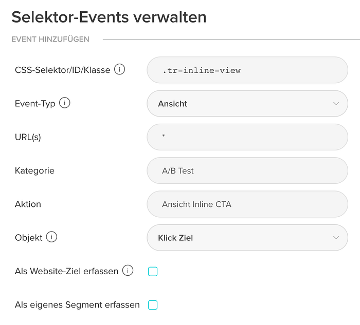
Creating the selector events
To enable tracking via CSS classes, the elements each require a unique CSS class per event and test. The name is freely selectable:
I decided to use the following CSS classes: tr-inline-view and tr-inline-click as well as tr-popup-view and tr-popup-click.
I covered the analysis of successful signups by using two identical newsletter signup forms. This way I can see at the end which list has the most website visitors signed up.
I stored the selector events in eTracker as shown in the following figure. It is important to put a dot in front of the class name. For Event-Type you can choose between Click and View, which is exactly what is needed for the test. The other selector events are created in the same way.
Evaluation of the results
Via the basic report “Events”, the desired figures can be displayed in eTracker via the segments “Category” and “Action” as well as a filter on the category names.
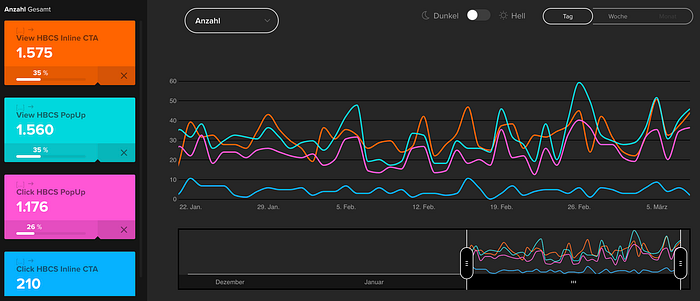
These values were then correlated with the newsletter sign-up results and — I think — yielded some exciting insights:
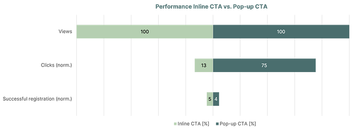
The results of the analysis show that pop-ups actually attract more attention and lead to more interactions than inline CTAs. This is also somewhat obvious, since the user is literally forced to perform an action.
However, it has also been shown that inline CTAs are at least as effective when it comes to driving conversions. Interestingly, the inline CTA achieved a slightly higher conversion rate than the pop-up, even though it received significantly fewer clicks. This could indicate that users using the inline CTA are less “pressured” to make a decision, while the inline CTA group can take their time to evaluate the CTA for themselves at their leisure, ultimately making the decision to convert more consciously.
Conclusion and significance of the results
Going back to my somewhat bold hypothesis from the beginning, “Inline CTAs generate more newsletter subscribers than pop-ups.” Whew, that one was confirmed quite narrowly.
By the way, there was no significant difference in the evaluation based on desktop or mobile devices. I didn’t include the tablet because of the small amount of data (about 130 views for both options).
For me, this means that it doesn’t always have to be a popup to achieve a conversion, but that an inline CTA is also sufficient, which is significantly less conspicuous for the website visitor and I find a more friendly option for the website visitor.
Outlook and next steps
In the following, this analysis lacks consideration of further optimization of the CTAs based on the findings:
- How can the registration via the pop-up be optimized?
- How can the click on the inline CTA be optimized?
I strongly suspect that answering both questions can positively influence both options.
The article was originally published in German “Pop-ups auf Webseiten: Zeitgemäß oder nervig?” on sabdk.com.
